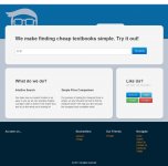
Site design: It clean and clear. You should consider adding a little bit more life in the left box below the search area. Maybe show a screen of the price comparison, etc.
Functionality: The search button text isn't crisp and the about us / contact us are hidden on Chrome 15.0.874.120m. Attached screen.
It looks fine on FireFox though. Simply put you need to do a better job on your CSS or fire the guy that made it and get someone that knows what they are doing. That should never ever happen with a correctly coded page. Only problem you should ever run into on cross platform is margins or paddings giving more spacing than required.
BTW the search button doesn't work on either browser FTL.
Going to any internal page results in going back to dev.pagenerds.com vs pagenerds.com. ( this happens when I click the logo ).
W3C Result: 92 Errors, 13 warning(s)... uh fix that shit.
In closing: You have a great idea and a good domain that you can rape with but you can't release it like this, fix it up man.


