The Best Logos Ever Created

IceToEskimos

Banned
Oct 18, 2011
5,415
130
0
www.linkedin.com
Arlington Pediatric Center:

logo-design-wrong-04.jpg


Catholic Church’s Archdiocesan Youth Commission:

logo-design-wrong-01.jpg


Kudawara Pharmacy:

27245666_77e9881053.jpg


KidsExchange:

logo-design-wrong-03.jpg


Megaflicks:

logo-design-wrong-02.jpg


Instituto de Estudos Orientais:

logo-design-wrong-06.jpg


Office of Government Commerce:

logo-design-wrong-07.jpg


(rotate 90 degrees)


The Computer Doctors:

434174036_a4597ef478.jpg


Who's got more?


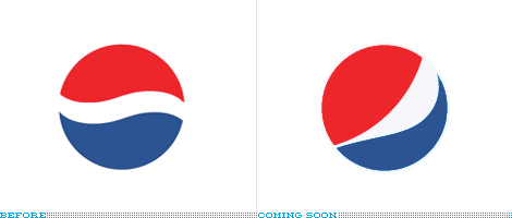
pepsi_logo.gif


Pepsi $1 million dollar redesign, along with their "design strategy" brief, which includes the usage of "DNA", "Dynamic Forces", "Multi-Dimensionalized", "Gravitational Pull", and last but not least, Mona Lisa.

http://jimedwardsnrx.files.wordpress.com/2009/02/pepsi_gravitational_field.pdf

+1 For the hustle.

I don't know if I should be thrilled or appalled by what the Arnell Group did here, but regardless of that fact, looking at their client list inspires envy and respect.
 
I don't know if I should be thrilled or appalled by what the Arnell Group did here, but regardless of that fact, looking at their client list inspires envy and respect.

There's a massive part of me that no matter how massive my ego became, could NEVER stomach speaking as much shit as they did about that Pepsi logo and keep a straight face.

Sure, I could take that cash from Pepsi, but I think eventually I'd smirk and go, "Yeah, you got me, I'm speaking shit. Worth a shot though, eh? See you later."
 
Pepsi $1 million dollar redesign, along with their "design strategy" brief, which includes the usage of "DNA", "Dynamic Forces", "Multi-Dimensionalized", "Gravitational Pull", and last but not least, Mona Lisa.

http://jimedwardsnrx.files.wordpress.com/2009/02/pepsi_gravitational_field.pdf

+1 For the hustle.

Whoever wrote that up is a master bullshit artist.

The Pepsi ethos has evolved over time. The vocabulary of truth and simplicity is a reoccurring phenomena in the brand’s history. It communicates the brand in a timeless manner and with an expression of clarity. Pepsi
BREATHTAKING builds on this knowledge. True innovation always begins by investigating the historic path. Going back-to-the-roots moves the brand forward as it changes the trajectory of the future.

The investment in our DNA leads to breakthrough innovation and allows us to move out of the traditional linear system and into the future.

dYlhng6.png


GijGVhx.gif
 

Of course it looks like the whole fucking process was overly contrived to justify reaming Pepsi for a simple distortion of their logo. There is something to the aesthetics of the design though. There are reasons why control groups overwhelmingly choose one logo or page design over another even when there are only minor differences between them. Knowing people's preferences beforehand can save you from a lot of extra split testing later on.
 
Have any of you read the Pepsi logo design document? I laugh at some of it, and am impressed by other aspects. If nothing else, it's a glimpse at the methodology that agency uses: http://adage.com/images/random/0209/pepsi-arnell021109.pdf

Wow...that was just the biggest piece of bullshit I've seen in a presentation.

Are they really using Geometry to sell the fact that they merely rotated the old logo to produce a new one?