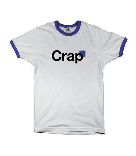
GAP just revealed their new logo... worst logo redesign ever seen in my life.
- Thread starter avatar33
- Start date
You are using an out of date browser. It may not display this or other websites correctly.
You should upgrade or use an alternative browser.
You should upgrade or use an alternative browser.
NickRac
ก้้้้้้&
Could this be a Marketing move? Could they have intentioanlly pushed a shitty logo knowing that it would be talked about all over the media and give them some visibility? I mean, think of the customer shopping at his local mall and then seeing the GAP store and being like "oh yeah so this is the new shitty logo I've been hearing about huh?" and then he might look at their "Jeans SALE" sign on the window and be like "hmm these pants look nice, I'll go check em out"
design team: "wait, you really submitted that? that was meant to be a joke"
"dude, its already printed, it's on all the trucks".
fuck it.
end result: what you see above.
Cool joke, bro.
http://www.youtube.com/watch?v=LBko_3wT44Q#t=1m46s
(O_o)
H̨̼̩͐̑͆̀̚&

Gotta give it to the advertising agency sales pitch, though.
haha, font nerd alert
This is funny shit. However, Twitter's new redesign was based on the "Golden Ratio" that is mentioned in this doc. Don't know if this validates anything.
The Golden Ratio is a pretty important concept in design. So much of what you look at every day is based on it, you just don't realize it. The Pepsi case study is certainly loaded with a bunch of BS, but it's incredibly thorough as well. If you're going to charge hundreds of thousands or millions of dollars for a corporate design it's nice to have a bit of thought, research and public opinion backing it up. Redesigns like this usually undergo massive scrutiny involving many people in focus groups, limited test runs into the wild, etc. etc.
I think this is what the Gap is doing here. This is a well thought out campaign by someone to release a pretty craptastic logo and then to illicit feedback in the form of design concepts. The CEO of the Gap even said on Huffington and the Gap facebook page that because of the negative feedback they've received they are going to open this up to public input. Think of the biggest 99designs contest ever without actually having to pay for the ideas! Brilliant!
Marka Hansen: The Gap's New Logo
The official word on getting people to submit their ideas, with more instructions to come...
Gap Thanks for everyone
Scroll down in the comments here to see people already submitting their own concepts...
Don't Mind the Gap, or the Square - Brand New

I quite like this one...

Here's the new logo in the wild though... a bit reminiscent of the original Gap stores... personally I think it would have looked better all lowercase...

The original...

Could this be a Marketing move? Could they have intentioanlly pushed a shitty logo knowing that it would be talked about all over the media and give them some visibility? I mean, think of the customer shopping at his local mall and then seeing the GAP store and being like "oh yeah so this is the new shitty logo I've been hearing about huh?" and then he might look at their "Jeans SALE" sign on the window and be like "hmm these pants look nice, I'll go check em out"
yeah, i think bad press is still press; they may be laughing right now
just can't believe they chose that logo unintentionally, in this modern age.
looks retarded... did they get it done on 99designs or some shit?
The quality would have been much better if it came form 99designs.
Wow. Utter fail indeed, generic font and all.
+1 for this coming from some 13-yr old on Fiverr.
Besides - why mess with a well established and recognizable logo that looks good?
*facepalm*
+1 for this coming from some 13-yr old on Fiverr.
Besides - why mess with a well established and recognizable logo that looks good?
*facepalm*


