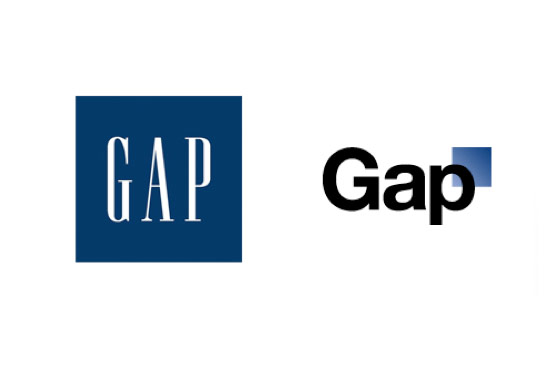
GAP just revealed their new logo... worst logo redesign ever seen in my life.
- Thread starter avatar33
- Start date
You are using an out of date browser. It may not display this or other websites correctly.
You should upgrade or use an alternative browser.
You should upgrade or use an alternative browser.
Awful. I'd love to see the creative brief filled with bullshit that the agency sent them though regarding the redesign. I don't know if any of you saw it, but the Pepsi one had epic levels of bullshit. Gravitational fields, references to the Parthenon inside....
http://jimedwardsnrx.files.wordpress.com/2009/02/pepsi_gravitational_field.pdf
http://jimedwardsnrx.files.wordpress.com/2009/02/pepsi_gravitational_field.pdf
LOLOL
and I wonder how much they paid for it
Probably more than $11!
Oh snap!
Yes he did...
Awful. I'd love to see the creative brief filled with bullshit that the agency sent them though regarding the redesign. I don't know if any of you saw it, but the Pepsi one had epic levels of bullshit. Gravitational fields, references to the Parthenon inside....
http://jimedwardsnrx.files.wordpress.com/2009/02/pepsi_gravitational_field.pdf
Thanks for sharing, reading now and saved to disk. I can only hope to bring my bullshit levels to such great altitudes...
fuckin hilarious that this piece of shit ever saw the light of day. When an agency produces this for you, you fire their asses and demand your money back
While they are probably working with an agency, they could very well have an in-house design team. You also can't fully blame the agency, you might have a CEO or some other executive playing Creative Director.
Either way, it's a horrible logo and there goes GAP's brand identity out the window.
Either way, it's a horrible logo and there goes GAP's brand identity out the window.
Awful. I'd love to see the creative brief filled with bullshit that the agency sent them though regarding the redesign. I don't know if any of you saw it, but the Pepsi one had epic levels of bullshit. Gravitational fields, references to the Parthenon inside....
http://jimedwardsnrx.files.wordpress.com/2009/02/pepsi_gravitational_field.pdf
This is funny shit. However, Twitter's new redesign was based on the "Golden Ratio" that is mentioned in this doc. Don't know if this validates anything.
This is funny shit. However, Twitter's new redesign was based on the "Golden Ratio" that is mentioned in this doc. Don't know if this validates anything.
I'm going to brief my salesguys on this golden ratio thing Monday.
Watch our sales skyrocket!


