Adaptive vs. Responsive - thoughts

Mike

New member
Jun 27, 2006
6,777
116
0
51
On the firing line
What's your take on adaptive vs. responsive designs?

In that same vein, what's the best method for determining if someone is using a tablet, desktop (laptop), or mobile phone?
 
  • Like
Reactions: JakeStratham


I found this extremely useful for adapative: Adaptive Images in HTML

I love both to be fair, and have advocated (and argued about here) RWD / Adaptive since I joined WF as you may recall.

The main thing from a back-end perspective is media query. Once you can determine the user's typical demographic (from their phone-type / location etc) you get to set off a whole load of triggers that funnels them in the direction you wish them to go - i.e. a conversion.

RWD to me is all about UX and that is important in converting too. If you base your sites on a fluid design from the start then you can't really go wrong. You can later include adaptive into too. Bear in mind adaptive will take up more space on your web-server, but could decrease your bandwidth and increase speed by serving smaller files (slightly moot point now that we have CDNs)
 
I think the whole responsive vs adaptive argument is just mincing words, with different definitions depending on who you're reading, and a good site design should consider all the technical issues covered by both approaches. I don't think trying to determine the kind of device a user is using is a good thing either, and isn't generally recommended. You should just be aiming to deliver the best experience possible at any given screen size and pixel density, no matter what device type the end user is using to view your site.
 
I am increasingly getting frustrated when websites don't render well on w/e half of 1080p is. If you snap a window to the left and to the right, many websites don't look right at all.
 
I am increasingly getting frustrated when websites don't render well on w/e half of 1080p is. If you snap a window to the left and to the right, many websites don't look right at all.

1080p is the vertical space, not the horizontal space. 1920px would be the horizontal space, half of which is 960px. Most websites should work at 960px, but if they have been made larger than this and haven't been made responsive, then they won't fit properly.
 
Well yes indeed, it's fairly ahh... I dunno - "six of one / half-a-dozen of the other" type debate, purely because it's also a question of which method gets the fucking job done quickest and best for each particular site. Use both. Use them together. Be a bit creative.
 
I've heard this before many time, and here:

If you base your sites on a fluid design from the start then you can't really go wrong.

Can you elaborate a bit please? I'm not a designer, so this statement has always confused me a bit.

How do you base your site, or even a single page on a fluid design? What constitutes a fluid design, or what elements should be used to make a page (or site) more fluid?
 
I am increasingly getting frustrated when websites don't render well on w/e half of 1080p is. If you snap a window to the left and to the right, many websites don't look right at all.

I've noticed this trend as well (e.g. the twentyfourteen default WP theme). I think it's because higher res screens on mobile devices have exceeded what used to be considered normal web size (960px wide).

That's where defining break-points solely on pixel width isn't as elegant as it used to be when we have PPI resolution ranges of anything from 80 to 400+ in the wild.
 
Gather round all ye gay webmasters for a quick lesson on the topic.


3038367-slide-s-1-9-gifs-that-explain-responsive-design-brilliantly-01responsive-vs-adaptive.gif


3038367-slide-s-3-9-gifs-that-explain-responsive-design-brilliantly-03with-breakpoints-vs-without-breakpoints-1.gif


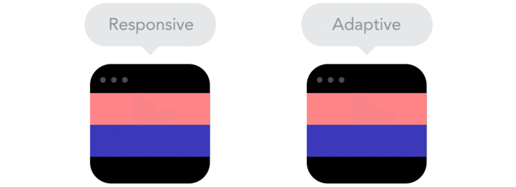
Responsive Web Design (RWD) got its name when the concept was first introduced in 2010. Responsive web sites use media queries and fluid grids to scale the interface up or down based on device or screen size.

Adaptive Web Design (AWD) was introduced around the same time as RWD, but approached the problem from the other end, using media queries to specifically target when your interface should adapt. Adaptive design made more sense before the tablet and mobile game went bonkers, but now that device and screen size aren't as predictable, responsive design has become the standard.

In both cases, media queries are the driving core of how the principles are applied. The difference is that responsive design starts at the smallest resolution range and scales up while adaptive design starts at your most ideal resolution and adapts down to the resolutions of your choosing. By these rules, responsive design is faster to develop but can also be more restricting. Regardless, responsive design has become the standard and adaptive principles are better suited for when you have specific interruptions that need to occur in your interface.

If your product was created within the last 3-4 years and it's not responsive, you're behind the curve.

Hope that shines some light. I'm assuming you marketer types know where to look to help you build responsive products, but if you need any direction, feel free to ask.
 
Are you referring to using like m.example.com and example.com and breaking it down that way? I hate that, I can understand some perks though to help with tracking, prob easier for server maintenance too.

Bootstrap default uses adaptive design and it makes sense if you ask me. It's harder to design something to look good at every single screen size vs. 3-5 'breakpoints'.
 
How do you base your site, or even a single page on a fluid design? What constitutes a fluid design, or what elements should be used to make a page (or site) more fluid?

Fluid just means that your containers and content are using percentages and relative units (rems/ems). To clarify microphone_head's comment, I think he's talking about the mobile-first approach, which is basically just responsive design.

When you start planning the design for your next web product, you might visualize an average desktop resolution as your starting point. Instead, think of how your content should behave starting from the smallest device and work your way up.

I am increasingly getting frustrated when websites don't render well on w/e half of 1080p is. If you snap a window to the left and to the right, many websites don't look right at all.

You might be referring to the retina display issues that got attention just last year. This is mostly solved, but it just might be a matter of time before the best practices are adopted in majority.

Just wait until people have to start developing for smart watches and smart glasses. Hell, when smart windshields become a thing, you're only going to see the nightmare continue. Fun times.
 
Bootstrap default uses adaptive design and it makes sense if you ask me. It's harder to design something to look good at every single screen size vs. 3-5 'breakpoints'.

Bootstrap's default is actually both. It's fixed width "adaptive" at higher resolutions, but becomes flexible "responsive" at lower resolutions.

It can be harder to design to look good at all screen sizes, but it's not that hard. I use a flexible outer wrapper but still have 6 breakpoints to reflow content as necessary while maintaining fluidity in between each breakpoint.

A good example of this would be the new CNN site design. There are a few niggling cosmetic issues that are bugging me on that site that would be easy to fix, but overall I think it's pretty well done.

Mike, if you haven't read Ethan Marcotte's "Responsive Web Design" book I highly recommend it. You should also add "Mobile First" by Luke Wroblewski to the reading list as well as the latest A Book Apart title "Responsible Responsive Design" by Scott Jehl. All of which can be found here...

A Book Apart, Brief books for people who make websites.

I also recommend the "HTML5 for Web Designers" and "CSS3 for Web Designers" titles. The "On Web Typography" one is good too.

All of their books are pretty light reads, but have tons of good info in them that is presented well. I think I pretty much own every title they've published.
 
Just don't be the guy whose content sits centered takes up like 400px while the empty sidebars take up te extra 1500px. That drives me fucking nuts.

Then comes page load speed. After that do whatever the fuck you wanna do.
 
Just wait 1-2 more years for browsers to support some new CSS stuff. With all this responsive design, the quality of graphics faded away. Everything now is just modern and simplistic, minimal. All sites look the same. I'm a bit old fashioned and I still like to give a personal touch to my sites, while keeping them functional and responsive.

On the other hand, I like to plan how a website will behave. Before diving into code or graphics, it's a good practice to sketch some divs, plan their behaviour and as boatBurner said, start from mobile, it's easier to scale up than down.

Last thing is the content, if you planned that one right from the first place, you'll have a much easier job when building the site.
 
Last thing is the content, if you planned that one right from the first place, you'll have a much easier job when building the site.

Oh sweet Jesus, yes. The most important thing. My 2015 resolution is to refuse client work from people that have no idea what their content is going to be. It's incredibly frustrating to try to design something properly without content. If you have no content, you have no website. Lorem Ipsum and empty placeholders are useless.
 
This. This. This. == The frustration of having the design 75% completed waiting for content from the client, and by the time you get the content you have lost the creative juices that went into the initial design process.

I have gotten to the point that if the client does not have content ready, I build into my bid copywriting services. They typically will not take it at first, but after a couple weeks of me begging for content the client eagerly will pay.

Oh sweet Jesus, yes. The most important thing. My 2015 resolution is to refuse client work from people that have no idea what their content is going to be. It's incredibly frustrating to try to design something properly without content. If you have no content, you have no website. Lorem Ipsum and empty placeholders are useless.
 
Oh sweet Jesus, yes. The most important thing. My 2015 resolution is to refuse client work from people that have no idea what their content is going to be. It's incredibly frustrating to try to design something properly without content. If you have no content, you have no website. Lorem Ipsum and empty placeholders are useless.

I lead an utter nightmare of a responsive retrofit for a client last year. I spent almost as much time making sure I learned from that ass pain of a project.

It was after that project that I truly appreciated the benefits of rapid prototyping. I won't say "never', but I'll be hard-pressed to use hi-fidelity mockups in my responsive workflow again. And when wireframing, I now require content as part of the wireframing process. Saves us all lots of headaches.
 
If I wanted to hire someone to create a responsive page from the ground up, where's the best place to start? In other words, who would you hire?
 
If I wanted to hire someone to create a responsive page from the ground up, where's the best place to start? In other words, who would you hire?

That would be anyone claiming to do front-end web dev and has experience (ideally examples) of work using responsive frameworks. Bootstrap and Foundation are probably the most popular. Find someone that knows one of those and use it. Any legit front-end dev should at least be familiar with one or the other.